OUR 9TH YEAR OF PROVIDING PROPRIETARY CAPITAL MARKETS INTELLIGENCE ON THE CANNABIS / HEMP / PSYCHEDELIC SECTORS
Quick
Links
Past Charts
Home » Viridian Capital Chart of the Week: Why Did Stocks Perform So Differently in the Capitulation Last Week?
Chart of the Week
Chart of the Week
The Viridian Capital Chart of the Week highlights key investment, valuation and M&A trends taken from that week’s Deal Tracker that we believe are impactful for investors, companies and acquirers.
Week ended 10/27/2023
Viridian Capital Chart of the Week: Why Did Stocks Perform So Differently in the Capitulation Last Week?
- How can we explain the cataclysmic capitulation in cannabis stock prices last week, with the MSOS ETF down 21.5%? Was it just a reaction to a less cannabis-friendly Speaker of the House? The timing of the decline, beginning in earnest on October 25, does seem to lend some credence to this view.
- However, looking more closely, we are skeptical. The Speaker doesn’t directly influence rescheduling, and the talk of rescheduling got the rally started. Furthermore, we have always believed that rescheduling was much more critical than the SAFER Act, which the Speaker would have a role in passing. Also, the SAFER Act seems to have widespread appeal on both sides of the House, and we wonder if a new Speaker would really want to waste political capital opposing such a bill.
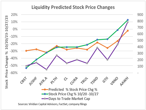
- The spread in the percentage price changes last week, shown by the green line on the graph, was dramatic, ranging from Cannabist (CBST: CBOE), down 53%, to Ascend (AAWH: OTCQX), up 13%. What variables explain the differences?
- We tested several theories:
- One theory we had high hopes for was that companies with poor cash flow available for equity would experience more significant downward pressure. We looked at each company’s net cash flow (EBITDA-Taxes-Interest Expense-CAPEX) as a percentage of Market Cap and related it to the percentage change in stock prices. The relationship was statistically insignificant for reasons that were easy to see. The worst performer, Cannabist, was quite close to the best performer on the net cash flow variable, and the third worst performer, AYR (AYR.A: CSE), had the best net cash flow to market cap.
- Another plausible theory was that companies trading at the highest multiples would fall the most. We tested the EV/2024 EBITDA multiple (at the beginning of the week) to see if it might be a good predictor, which was disappointing. The two highest multiple companies, Curaleaf (CURE: CSE) and TerrAscend (TSND: TSX) had middle-of-the-group performance, while the best and worst performers again had quite similar beginning valuation multiples.
- Relative liquidity has the best predictive power of the theories we tested. Ironically, the companies with the highest relative liquidity traded down the most! We looked at the Days to Trade the Market Cap (Mkt cap/ average daily dollar volume), shown by the purple line on the graph, as a predictor of last week’s performance. The orange line in the chart shows the predicted stock price changes based on this ratio. The regression offers a good fit to the data with a .52 r-squared and a significant t score (p<.01). The market traded out of the stocks with the most liquidity relative to their market cap.
- Investors should know that companies with the highest trading volume are not necessarily the most liquid. $ trading volume should be in proportion to the market cap. Also, investors should be aware that liquidity is not always your friend. Other investors are likely to sell their most liquid holdings, and these stocks often underperform in down markets like last week.