OUR 9TH YEAR OF PROVIDING PROPRIETARY CAPITAL MARKETS INTELLIGENCE ON THE CANNABIS / HEMP / PSYCHEDELIC SECTORS
Each week, Viridian publishes insights and analysis on completed capital raise transactions in the prior week, focusing on all equity and debt deals. Our analysis includes:
- Summary
- Outlook
- Best & Worst Perfromers
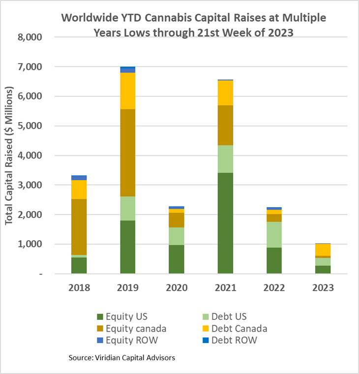
- Cannabis capital raises are off to a multi-year low. Only $1,027.77M closed through the first twentieth weeks of the year compared to $2,245.41M last year.
- Debt represents 61.1% of total capital raised, significantly higher than in any other comparable period since 2018.
- Public companies have raised only 66.9% of total capital YTD, down from 78.1% last year.
VIRIDIAN INSIGHTS
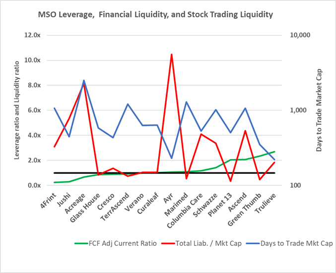
- Liquidity is becoming more important as the capital markets continue to be highly restrictive.
- The graph below puts three critical liquidity indicators together to give a perspective on which companies will likely need to raise cash and what the market leverage and stock liquidity say about how these financings are likely to be structured.
- The green line represents the free cash flow adjusted current ratio, our favorite liquidity indicator. Numbers below one indicate a likely need for additional financing during the year, while negative numbers indicate severe liquidity stress. The red line is the Total Liabilities to market cap. We have found that numbers above 3x signal the need for greater scrutiny and caution. Finally, the blue line (measured on the right axis) is the days it would take to trade the company’s entire market cap based on the stock’s YTD average dollar volume. The lower the blue line, the more relatively liquid the stock is.
- Companies with low green lines and high red and blue lines (like 4Front, Jushi & Acreage) are the most concerning.
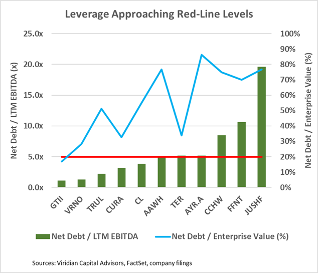
- The cannabis industry is pushing the limits of debt financing. The graph below presents a dual view of leverage: Net Debt / LTM EBITDA and Net Debt / Enterprise value. Net Debt / LTM EBITDA over 3x is problematic in a 280e world. If a company has 3x leverage, 10% average debt cost, and a 40% tax rate based on EBITDA, its payback period on its debt will equal ten years, not accounting for capex or working capital changes. The graph draws a bright red line at 5x leverage, a number we consider unsustainable long term.
- Five of the eleven companies on the list are over the 5x line. The blue line indicates net debt/enterprise value. Higher blue lines indicate a lower percentage of cushion between the market value of the assets and the debt.
- Companies with high green bars and high blue lines face a potentially tricky choice: They are already overleveraged and may find it difficult to issue more debt, but their lack of financial cushion is likely to negatively affect their stock price and make doing an equity issue quite painful. An equity-for-debt swap might be one possible solution. This possibility will be particularly intriguing for companies with significant crossover investors.
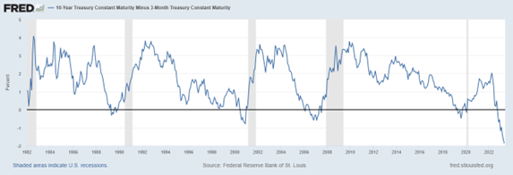
- The three-month-ten-year spread became 18bps more inverted at -186bps. The graph below shows that the inverted curve has correctly predicted the last five recessions, and typically, the curve becomes normal and then steepens as the recession commences. There is another way that the yield curve normalization could occur, however. Let’s consider some extra data points to illustrate: the two-year treasury yield is now 4.46%, while the 1-year rate is 5.22%. Putting those two together, we can derive the one-year forward, one-year rate of 3.98%. Today’s yield curve tells us that one-year rates will decline by 125 bp over the next year. How will this happen? Our read is that we are likely to be in a relatively severe recession, forcing the Fed to cut rates to keep the economy from tanking. The bond market believes this is the story and has the last five recessions as proof. Meanwhile, the equity market continues to behave like a recession is unlikely, with the S&P500 up 9.5% YTD. Which market do you think is right?
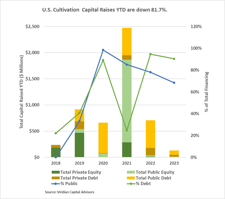
- YTD, U.S. Cultivation & Retail sector capital raises are down 81.7% from 2022.
- Debt is still the only game in town, accounting for 90.4% of all cultivation sector capital raised. All the debt raised YTD has been for public companies.
- Large transactions are still absent from the market. There have been no debt or equity deals over $100M YTD.
- Cannabis equities (as measured by the MSOS ETF) were up .75% for the week as earnings season drew to a close.
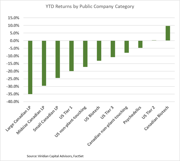
YTD Returns by Public Company Category
- U.S. MSOs improved relative to their Canadian counterparts, at least in part due to steep declines in Tilray, HEXO, Aurora, and Canopy Growth.
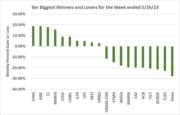
Best and Worst Performers of the last week and YTD